Friday, December 12, 2008

Thursday, November 27, 2008

Another Stab


Heres another stab at my infograph

Friday, November 14, 2008

Thursday, November 13, 2008

catch up


more on way

Sneek Peek


Heres a sneek peek on the start of one of my spreads in my type specimen book, and the start of my new bag display. Hopefuly I'll have a printed book by wed.

Saturday, November 1, 2008

tech issues

Seems to be a lot of problems with my last post. The label that I thought saved ok seems to be off. Its darker...wayyyyy darker, has a grid showing and some things are transparent. I don't know what the hell is up with my computer but a better one should be up soon -EB

Thursday, October 30, 2008

household product


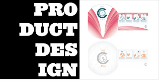
Hello, this is my house hoold bag. The CHILL OUT BAG. you use it when you have anxiety attacks or have a hard time breathing. the label on the bottom are the real colors. the pictures on top are of the label on the bag, but the colors are inveted for some reason. I'll try to have a better picture up. Suggestions would be helpful.
thanks -EB

Friday, October 24, 2008

Revisited 3


I changed the "nineteen" type face to make it appear lighter because it was so heavy. This is not the final typeface. I think i can find a nicer lighter typeface. btw this is my opening spread. I want a blank page on the otherside. What do you think? anyways, I am currently working on this, two other pages, the infograph and the product design. I want to post again tonight but it looks like I'll have to wait until tommorrow when I get out of work. I'll try my best to catch up. -EB

Thursday, October 23, 2008

Revisited 2


Hello again, here is another piece which was reworked. This second was suggested that I take out the "lock up" text on the bottom and bring out the middle text. The first is one with a less distractive look of the lockup imo. I really like it and I don't want to lose it. Anyways, more to come. -EB

Revisited


Hello, these are two different versions of a revisited spread of my type specimen book I removed the type off the major type piece and tried to establish a heirachy within the spread. The different verisons have different type treatments on the upper left. I like the one one top but decided to show both because I have a feeling people will feel like it looks to heavy, considering the color and where it sits. Anyways, I just now have access to the internet so more will come shortly. -EB

Wednesday, October 22, 2008

Friday, October 17, 2008

one of my ideas


This was one of my ideas for he infograph. I'll post the other shortly. I think i'll start from scratch again. I'm not happy with either

Wednesday, October 1, 2008

Suvey fo' my infograph

this is my servey for my info graph
http://www.surveymonkey.com/s.aspx?sm=TiHG0sCaMUqnp235py_2f06g_3d_3d
It's about when you learned or experinced things while growing up

Saturday, September 27, 2008

Friday, September 26, 2008

another page


This is my ballot spread. The idea for this page is, the ballot holes for the canidates on the left fall in the spine. Its kind of a subtle way of leading the voter to the ballot hole on the right. I will be changing small type on this page. More on the way

Wednesday, September 24, 2008

other stuff


these are some of my spreads. I'm having a little problem with my computer, so I'll post the rest later. These spreads are almost done, I just want to add some textures to it. I will also post my fonts ASAP.